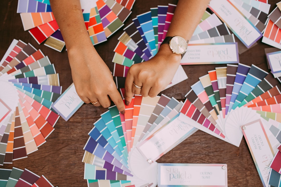
Color is one of the most powerful tools in a designer's arsenal. The right color palette can evoke emotions, communicate messages, and create memorable visual experiences. In this comprehensive guide, we'll explore the fundamentals of color theory and how you can apply these principles to elevate your design projects.
Understanding the Color Wheel
The color wheel is the foundation of color theory. It's a circular diagram that shows the relationships between primary, secondary, and tertiary colors. The three primary colors—red, blue, and yellow—cannot be created by mixing other colors. Secondary colors (green, orange, and purple) are created by mixing primary colors. Tertiary colors are created by mixing primary and secondary colors.
Color Harmonies
Color harmonies are the pleasing arrangements of colors based on their positions on the color wheel. Here are some common color harmonies that designers use:
- Complementary: Colors that are opposite each other on the color wheel (e.g., blue and orange)
- Analogous: Colors that are adjacent to each other on the color wheel (e.g., blue, blue-green, green)
- Triadic: Three colors that are evenly spaced around the color wheel
- Split-complementary: A base color and the two colors adjacent to its complement
#FF5733
#33A8FF
#33FF57
#8333FF
#FF33A8
Color Psychology
Different colors evoke different emotions and associations. Understanding color psychology can help you choose the right colors for your design projects:
- Red: Energy, passion, excitement, danger
- Blue: Trust, calmness, stability, professionalism
- Yellow: Optimism, happiness, warmth, caution
- Green: Growth, nature, health, wealth
- Purple: Luxury, creativity, wisdom, spirituality
- Orange: Enthusiasm, creativity, determination
- Black: Sophistication, power, elegance, mystery
- White: Purity, cleanliness, simplicity, minimalism
Practical Tips for Using Color in Design
Here are some practical tips to help you use color effectively in your design projects:
- Start with a limited color palette of 2-3 main colors and add accents as needed
- Use the 60-30-10 rule: 60% dominant color, 30% secondary color, 10% accent color
- Consider the context and audience when choosing colors
- Ensure sufficient contrast for readability, especially for text
- Test your color choices across different devices and lighting conditions
- Don't forget to check for color accessibility to accommodate users with color vision deficiencies
By mastering the basics of color theory, you'll be able to make more informed color choices that enhance your designs and communicate your intended message effectively. Remember that while these principles provide a solid foundation, don't be afraid to experiment and develop your unique color sensibility.
Typography is more than just selecting fonts—it's about creating visual hierarchy, improving readability, and conveying the right tone for your design. Good typography can make the difference between a mediocre design and an exceptional one. This comprehensive guide will help you understand the fundamentals of typography and how to use it effectively in your design projects.
Anatomy of Typography
Understanding the anatomy of typography is crucial for making informed design decisions. Here are some key terms to know:
- Baseline: The invisible line where letters sit
- X-height: The height of lowercase letters (specifically the letter 'x')
- Ascender: The part of a lowercase letter that extends above the x-height
- Descender: The part of a lowercase letter that extends below the baseline
- Serif: The small lines attached to the ends of letters in certain typefaces
- Sans-serif: Typefaces without serifs
- Kerning: The space between individual letters
- Leading: The vertical space between lines of text
Font Categories
There are several categories of fonts, each with its own characteristics and appropriate uses:
- Serif: Classic, traditional, authoritative (e.g., Times New Roman, Georgia)
- Sans-serif: Modern, clean, minimal (e.g., Helvetica, Arial)
- Script: Elegant, personal, creative (e.g., Brush Script, Zapfino)
- Display: Decorative, attention-grabbing, unique (e.g., Impact, Cooper Black)
- Monospace: Each character takes up the same amount of space (e.g., Courier, Consolas)
Font Pairing
Selecting complementary fonts is an important aspect of good typography. Here are some proven font combinations that work well together:
Playfair Display
Paired with Source Sans Pro for a classic, elegant combination that works well for editorial designs.
Montserrat
Paired with Merriweather for a modern, balanced look perfect for websites and branding.
Roboto Slab
Paired with Roboto for a cohesive, contemporary feel that maintains excellent readability.
Typography Hierarchy
Typography hierarchy helps guide the reader through your content by showing them what's most important. Here's how to create an effective typography hierarchy:
- Use size variation to distinguish between different levels of information
- Apply weight changes (bold, regular, light) to create contrast
- Use different font families for headings and body text
- Apply color selectively to highlight important elements
- Utilize spacing to group related information and separate different sections
Typography Best Practices
Follow these best practices to ensure your typography is effective and professional:
- Limit your design to 2-3 font families to maintain coherence
- Ensure adequate contrast between text and background for readability
- Use appropriate line height (leading) to improve readability (generally 1.4-1.6 times the font size)
- Pay attention to line length—ideally 45-75 characters per line for optimal readability
- Be consistent with your typography choices throughout your design
- Consider the context and medium—what works in print may not work well on screens
- Test your typography at different sizes to ensure it remains readable
Typography is both an art and a science. By understanding these fundamental principles and practicing regularly, you'll develop an eye for effective typography that enhances your designs rather than distracting from them. Remember that the ultimate goal of typography is to serve the content—making it accessible, readable, and enjoyable for your audience.
As we move deeper into 2024, graphic design continues to evolve with new trends emerging and others evolving from previous years. Staying up-to-date with these trends can help you keep your designs fresh and relevant. In this article, we'll explore the most influential graphic design trends of 2024 that are shaping the visual landscape across digital and print media.
Top Graphic Design Trends of 2024
Here are the most significant trends that are defining graphic design in 2024:
1
Anti-Design and Brutalism 2.0
The rebellion against conventional design principles continues but with more refined execution. Designers are embracing imperfection, asymmetry, and raw aesthetics while maintaining usability. This evolved brutalism incorporates clashing colors, experimental typography, and unconventional layouts but with more intentional application than its earlier iterations.
2
AI-Generated and AI-Enhanced Design
Artificial intelligence tools have become mainstream in the design process. Designers are using AI not just for generating initial concepts but for enhancing and refining work throughout the creative process. The collaboration between human creativity and AI capabilities is producing unique visual styles that would be difficult to achieve manually.
3
Eco-Aesthetics and Sustainable Design
Environmental consciousness is strongly influencing design aesthetics. Organic shapes, natural textures, earthy color palettes, and visuals that communicate sustainability are prevalent. Designers are also considering the environmental impact of their work, from digital carbon footprints to materials used in print designs.
4
Maximalism with Purpose
After years of minimalism dominating design, maximalism has returned with bold colors, intricate patterns, and layered elements. However, 2024's maximalism is more purposeful and strategic than chaotic. Designers are using abundant elements to tell complex stories and create immersive experiences while maintaining clear visual hierarchy.
5
Dynamic Typography
Typography is becoming more experimental and interactive, especially in digital environments. Variable fonts, kinetic typography, and custom letterforms are being used to create distinctive brand identities and engaging user experiences. Text is no longer static but responds to user interaction or conveys meaning through movement.
6
Nostalgic Futurism
This trend combines retro aesthetics with futuristic elements, creating a sense of familiar yet forward-looking design. We're seeing Y2K aesthetics, 90s-inspired graphics, and vintage elements reimagined with contemporary techniques and futuristic concepts.
7
Immersive 3D and Extended Reality
As technology evolves, 3D design is becoming more accessible and sophisticated. Designers are creating immersive 3D environments, realistic product visualizations, and extended reality experiences that blur the line between digital and physical worlds. This trend is particularly evident in product design, branding, and web experiences.
How to Incorporate These Trends
When incorporating these trends into your work, consider the following guidelines:
- Don't follow trends blindly—adapt them to fit your brand identity and message
- Consider your audience and whether a particular trend will resonate with them
- Focus on longevity—some trends may have a short shelf life
- Start with small elements before committing to a trend-driven redesign
- Combine multiple trends thoughtfully to create something unique
While trends provide inspiration and keep your designs current, they should serve your communication goals rather than dictate them. The most effective designs balance trendy elements with timeless principles of good design. By understanding the "why" behind these trends, you can incorporate them meaningfully and create work that feels contemporary yet authentic to your brand or message.
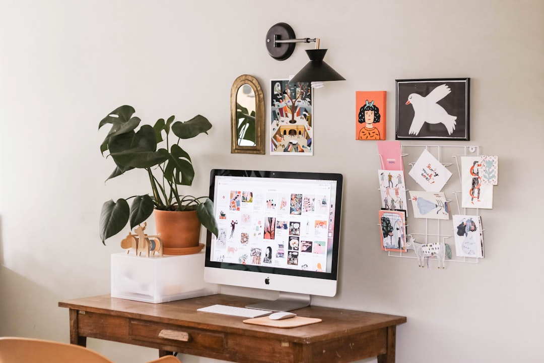
In today's fast-paced design industry, having the right tools at your disposal can significantly impact your efficiency and the quality of your work. While creativity is the foundation of good design, mastering the right software allows you to bring your ideas to life effectively. Here's our curated list of 10 essential design tools that every graphic designer should master in 2024.
How to Choose the Right Tools for You
When deciding which tools to invest your time in learning, consider these factors:
- Your design specialty: Focus on tools that are industry standards in your niche
- Client requirements: Some clients may require deliverables in specific formats or software
- Budget considerations: Balance subscription costs with functionality needs
- Learning curve: Some tools are more intuitive than others
- Workflow integration: Choose tools that work well together
Remember that while mastering these tools is important, they're ultimately just vehicles for your creativity. The best designers know when to use which tool and how to leverage their features to bring their creative vision to life efficiently. Start with the tools most relevant to your work, and gradually expand your skillset as needed.
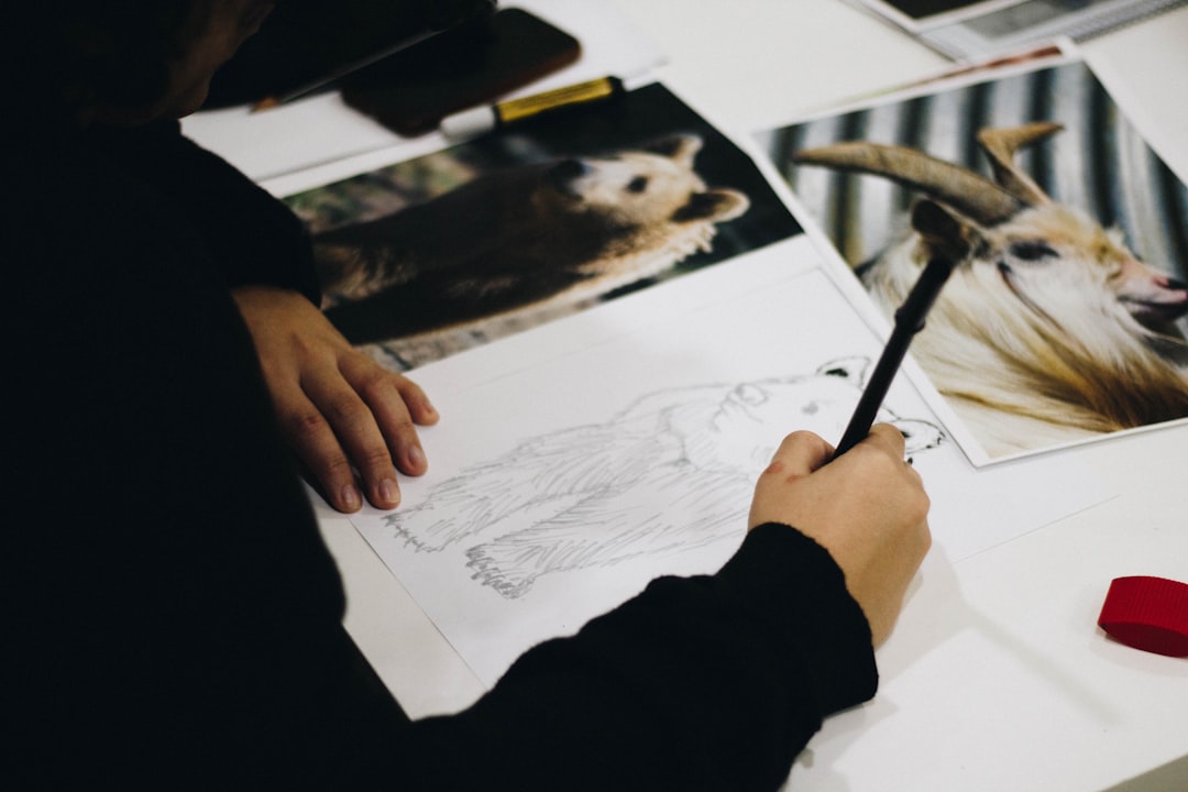
As you progress in your design career, mastering advanced techniques becomes essential for creating standout work. These techniques go beyond the basics and can help you solve complex design problems, create more compelling visuals, and develop a distinctive style. In this article, we'll explore five advanced design techniques that can elevate your work to the next level.
1
Master Visual Hierarchy Through Micro-Adjustments
Advanced designers know that subtle adjustments can have a powerful impact on visual hierarchy. This technique involves making precise micro-adjustments to elements like spacing, size, contrast, and alignment to guide the viewer's eye exactly where you want it to go.
To implement this technique:
- Establish a clear primary focal point and secondary points of interest
- Use incremental adjustments (1-2px at a time) to fine-tune relationships between elements
- Test your hierarchy by blurring your design or viewing it at thumbnail size
- Refine until the visual flow feels natural and intuitive
2
Color Theory Beyond the Basics: Psychological Color Mapping
While basic color theory is essential, psychological color mapping takes your use of color to a more sophisticated level. This technique involves strategically using color to create emotional responses and guide user behavior based on psychology and cultural associations.
How to implement psychological color mapping:
- Create a psychological color profile for your target audience
- Map different emotions and actions to specific colors in your palette
- Use color to create subtle psychological cues throughout your design
- Test color variations with target users to refine emotional impact
- Consider cultural differences in color perception for global audiences
3
Advanced Grid Systems and Modular Scaling
Moving beyond basic grids, advanced designers use complex grid systems and modular scaling to create harmonious, mathematically-sound designs with perfect proportions.
To master advanced grid systems:
- Experiment with compound grids (overlapping multiple grid systems)
- Implement modular scales based on mathematical ratios (golden ratio, fibonacci sequence)
- Use a modular scale to determine your type hierarchy and spacing system
- Create custom grid systems specific to your project's unique requirements
- Allow for controlled grid-breaking when it serves the design purpose
4
Conceptual Juxtaposition and Visual Metaphors
This technique involves creating visual tension and interest by juxtaposing contrasting ideas or using unexpected visual metaphors to communicate complex concepts.
To implement conceptual juxtaposition:
- Identify the core concept or message you want to communicate
- Brainstorm seemingly unrelated visual elements that could represent this concept
- Create unexpected combinations that provoke thought or emotion
- Use visual metaphors to simplify complex ideas
- Ensure the juxtaposition serves your communication goals rather than confusing the audience
5
Narrative-Driven Design Approach
Advanced designers know that powerful design tells a story. This technique involves structuring your design process around narrative principles to create more engaging and cohesive user experiences.
To implement a narrative-driven approach:
- Define the "character" (user) and their journey through your design
- Identify the emotional arc you want users to experience
- Create visual pacing through your design (introduction, rising action, climax, resolution)
- Use visual storytelling techniques like foreshadowing and reveal
- Ensure every design element serves the overall narrative
Implementing These Techniques in Your Workflow
To successfully integrate these advanced techniques into your design process:
- Focus on mastering one technique at a time
- Create personal projects specifically to practice these techniques
- Analyze designs you admire through the lens of these techniques
- Seek feedback from experienced designers on your implementation
- Document your process and learnings for future reference
Remember that advanced techniques should enhance your design's effectiveness, not complicate it unnecessarily. The best designers know when to apply complex techniques and when simplicity serves the purpose better. With practice and intentional application, these techniques will become natural parts of your design thinking, helping you create more sophisticated, effective, and memorable work.